Once you draw customers to your ecommerce website, your ultimate goal is getting them to complete a purchase, so you need to design the ideal path to smoothly steer them through your product pages and to the payment page. Often, a single snag in this process is enough to make customers leave your site — we call this checkout abandonment.
This one mistake can cost you a lot and hurt your bottom line. One of the leading causes of checkout abandonment is an overly complex checkout process; naturally, a complicated payment process discourages customers from completing the transaction.
The Difference Between Checkout Abandonment and Cart Abandonment
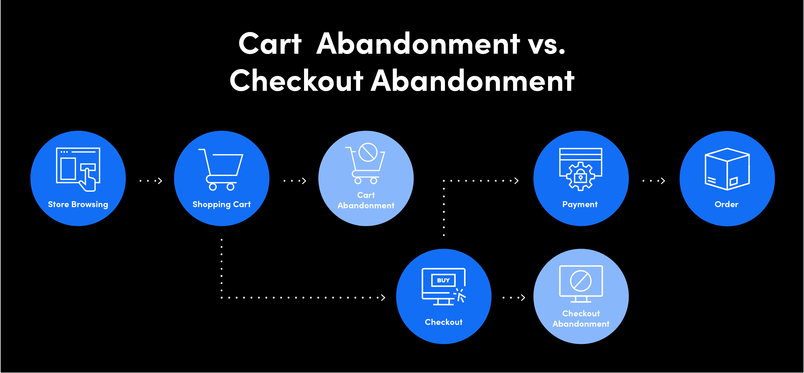
Checkout abandonment is when customers go through their journey, add items to their cart, and are ready to pay — but drop off the site after entering their payment information at checkout. This can occur whether the customer is using a registered account on your site or checking out as a guest.
Cart abandonment is similar to checkout abandonment. The main difference is the stage at which the customer leaves. Cart abandonment can occur at any stage after items have been added to the cart, but before checkout.

If you’re wondering how high your checkout abandonment rate is, you can determine the rate by using the following calculation:
Total Number of Completed Transactions ÷ Total Number of Initiated Transactions =
Checkout Abandonment Rate
To calculate the percentage, subtract the number you obtained from the calculation above from one and multiply by 100.
For example, if you had 100 completed transactions and 120 initiated transactions, your calculation would be as follows:
100 ÷ 120 = .833
1 – .833 = .167
.167 x 100 = 16.7%
Since checkout abandonment happens after a customer visits the cart, the rate at which it happens should be lower than the cart abandonment rate.
The Most Common Reasons Why Customers Abandon the Checkout
The last steps in the checkout process are crucial for finalizing sales, and there are several studies on the reasons for checkout abandonment. Below is a list of the top reasons for checkout abandonment.
1. Complex Checkout Process
The more steps in the checkout process and the longer it takes, the greater the chance for customer frustration, which often leads to checkout abandonment. According to the Baymard Institute, the average checkout flow has 5.08 steps, so the goal should be a checkout flow of less than five steps.
What can help here is optimizing the customer journey by reducing the number of steps to checkout and cutting off any distractions, including non-related links, social buttons, graphic elements, etc.
Keep customers on the same page during the entire checkout process. Don’t redirect them to an external service to pay, as it may severely hurt conversion. It’s also essential to offer a “guest checkout” option, especially for one-time buyers that want to finish the process quickly.
2. Slow-Loading Pages
A study by Radware shows that a two-second delay in load time during a transaction results in an 87% cart abandonment rate, as this kind of delay fails to build the user’s trust or confidence in the site.
Online shoppers are impatient, so avoiding any load time delays is important — especially on mobile, as people expect a quick shopping experience on the go. It’s wise to simply remove anything that can harm the checkout page’s loading speed.
A “remember me” option in the checkout can also speed up the process. It allows repeat customers to skip typing in their credit card number each time they want to buy something. Think about how convenient it would be for them to pay in just one click without having to input their credit card information.
3. Checkout Errors and Downtimes
Checkout errors, especially when they appear frequently, are a significant cause of checkout abandonment. When these kinds of errors occur, it’s common for customers not to bother proceeding. When they lose trust in your service in this way, you can be sure those users will likely go elsewhere to buy similar products.
To avoid checkout errors, test and monitor your website regularly. Check everything twice and edit and proofread your payment pages to ensure that they’re perfect and error-free. Also, make sure your current payment provider is a reliable partner. If it reports frequent downtime, you may lose revenue due to unplanned outages.
4. Checkout Security Concerns
Statistically, around 20% of customers will abandon their checkout if they feel unsure or unsafe because of the webpage they’re on. They won’t enter their credit card details if something feels wrong when they’re on the payment page.

It’s imperative that customers feel safe on your website, especially when they pay. Therefore, you need to reassure them that their sensitive data is well protected during checkout. Here are a few ways you can do this:
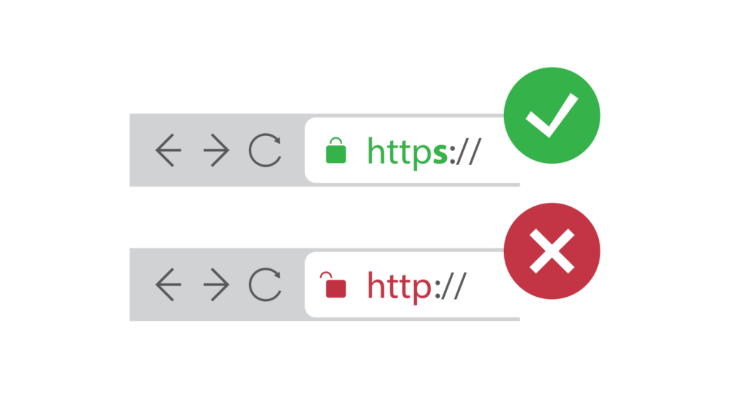
- Make sure your website has a high-encryption security certification — customers want to know that you have security tools and solutions in place.
- Outsource your payment process to a trusted payment provider with PCI compliance and fraud prevention tools in place.
- Add logos from leading organizations that people will recognize and trust as well as card brand logos.
- Review the design of your payment pages, as poorly designed pages can raise suspicions. When customers end up on a payment page that has a completely different design than your online store, it can cause hesitation.
- Improve your business’s credibility by posting testimonials and reviews on your website.
5. Hard-to-Understand Error Indicators
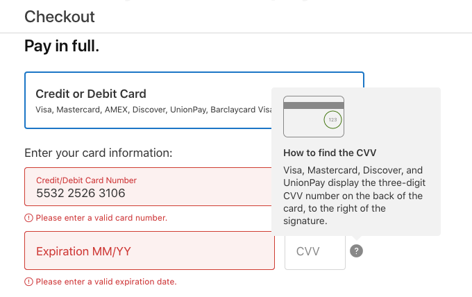
Communicate errors clearly and avoid ambiguous messages that create confusion — such as “some fields are incorrect.” Users may misinterpret instructions on the payment form, so you want to be as clear as possible. One way to simplify things is by matching the credit card field sequence to the physical card sequence — this makes entering data more intuitive for the customer.

6. Declined Credit Card
Declined transactions also prevent users from completing a purchase on a website. Make sure the payment form design and all the information are as straightforward as possible to reduce the number of mistakes a user can make when entering their payment data which could result in a declined transaction.
Also, ensure that your payment provider delivers a fraud system with dynamic rules that adjust quickly to specific industries and situations so that it won’t cause falsely rejected payments. You should have an option to proactively manage fraud rules to keep your finger on the pulse of the checkout process.
Credit Card Checkout UX at the Forefront
One of the Baymard Institute’s checkout studies evaluates the user experience (UX) for many leading ecommerce websites and shows that only 23% of sites are rated from “good” to “perfect”, while 25% of sites are rated “poor”.

The same study also reveals that the average site has 31 preventable usability issues in its checkout flow, so there’s still a lot of room for improvement.
Stick to the rule that the more steps a transaction has, the lower your chances of converting an almost-buyer into a customer. Analyze your purchase funnels regularly to identify areas that may keep your customers away and remember that not every customer abandons the checkout process for the same reason.
Winning at Conversions
You can reduce and overcome checkout abandonment by providing customers with a streamlined payment process based on top-notch user experience. Choose a payment provider that offers best-in-class embedded payments with optimized checkout and payment APIs that allow you to design the entire payment process the way you want.
Even though it’s impossible to ensure 100% of customers complete a purchase, you now know what you can do to improve your checkout experience. It’s important to reduce the steps it takes to make a payment. This gives customers less time to reconsider their purchase and creates a better user experience.
Are you looking for a payment provider with a user-friendly checkout and payment system optimized to maximize conversions? Go ahead! Test the Shift4 checkout process or contact our sales team for more information.
